I operate a bunch of different sites and have done for many years now.
Some of them get quite a lot of traffic and require a high level of uptime.
To monitor the uptime of these sites, I use various tools to alert me when a site is unreachable, when a specific resource is returning an unexpected status code, or if one of the database heavy pages starts taking a while to respond to requests.
I have found that the last issue around heavy database-driven sites/pages has become the most problematic.
I have also found that while tweaking database commands to speed things up, performing an end-to-end request is much better than simply testing the SQL directly.
Creating a simple script
To do this I wrote a super simple Python script which shows me how a page is responding.
import requests
import time

def test(domain):
    start = time.time()
    user_agent = 'Mozilla/5.0 (Macintosh; Intel Mac OS X 10_9_3) AppleWebKit/537.36 (KHTML, like Gecko) Chrome/35.0.1916.47 Safari/537.36'
    r = requests.get(domain, headers={'User-Agent': user_agent})
    print(time.time()-start)
Make sure you have requests installed. You can do this by running a pip install requests or pip3 install requests.
Let’s try our script out!
for _ in range(50):
    test("https://statvoo.com/")
This really couldn’t be easier, and I get a view of peaks and troughs:
0.1707608699798584
0.16441607475280762
0.15958285331726074
0.16867613792419434
0.19333314895629883
0.200239896774292
0.18515300750732422
......
0.17246222496032715
0.17450976371765137
0.16481328010559082
0.14270520210266113
0.18979692459106445
0.15845298767089844
0.15792512893676758
0.14095187187194824
It’s quite primitive, but that’s just the point. You don’t always need to create some elaborate and costly solution when something simple will suffice.
Let’s make it better visually
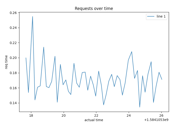
We all love staring at the command-line, but I also love staring at graphs!
So why not throw in a bit of MatplotLib to the mix?
To get the x and y coordinates of our graph, we also need to adjust the test function a bit to return the current time as well as the time the request took to complete.
Then we loop through each request and append it’s responses to our temporary lists to build our graph.
import requests
import time
import matplotlib.pyplot as plt

def test(domain):
    start = time.time()
    user_agent = 'Mozilla/5.0 (Macintosh; Intel Mac OS X 10_9_3) AppleWebKit/537.36 (KHTML, like Gecko) Chrome/35.0.1916.47 Safari/537.36'
    r = requests.get(domain, headers={'User-Agent': user_agent})
    return time.time(), time.time()-start


x1, y1 = [], []

for _ in range(50):
    x, y = test("https://statvoo.com")
    x1.append(x)
    y1.append(y)

plt.plot(x1, y1, label="req")
plt.xlabel('actual time')
plt.ylabel('req time')
plt.title('Requests over time')
plt.legend()
plt.show()
To run this python3 script, you will need to have installed requests as well as matplotlib using pip/pip3.
Once we run this new and updated script, it will produce a graph much like the following, even when running this script from our command-line:

This gives us a clearer picture of the overall performance, and it was dead simple too.
